目次
リソースを使う
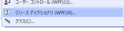
外部リソースを定義する
プロジェクトに ResourceDictionary を追加する。
外部リソースを読み込む。
<UserControlResources>
<ResourceDictionary>
<ResourceDictionary Source="/Styles.xaml"/>
</ResourceDictionary>
</UserControlResources>
複数ある場合は、MergedDictionaries を使う。
<UserControlResources>
<ResourceDictionary>
<ResourceDictionaryMergedDictionaries>
<ResourceDictionary Source="/Styles1.xaml"/>
<ResourceDictionary Source="/Styles2.xaml"/>
</ResourceDictionaryMergedDictionaries>
</ResourceDictionary>
</UserControlResources>
App.xaml で設定するとアプリケーションスコープで利用できるようになる。
方法: アプリケーション スコープのリソース ディクショナリを使用する - WPF .NET Framework | Microsoft Docs
プリミティブ型の利用
.NET Core (3.1) の宣言。
xmlns:system="clr-namespace:System;assembly=System.Runtime"
.NET Framework は多分これ。(試してないけど古い検索結果は大体こっち)
xmlns:system="clr-namespace:System;assembly=mscorlib"
あとはリソースを定義する。
<systemDouble xKey="FontSize">18</systemDouble>
Grid の RowDefinitions / ColumnDefinitions の長さを定義する
ピクセルの場合
<GridLength xKey="RowHeight">100</GridLength>
パーセントの場合
<GridLength xKey="RowHeight">1*</GridLength>
自動の場合
<GridLength xKey="RowHeight">Auto</GridLength>
利用方法
<GridRowDefinitions>
<RowDefinition Height="{StaticResource RowHeight}"/>
<RowDefinition Height="{StaticResource RowHeight}"/>
</GridRowDefinitions>
スタイル
使い方
<WindowResources>
<Style TargetType="RadioButton">
<Setter Property="VerticalAlignment" Value="Center"/>
<Setter Property="HorizontalAlignment" Value="Center"/>
<Setter Property="Margin" Value="10"/>
<Setter Property="LayoutTransform">
<SetterValue>
<ScaleTransform ScaleX="2.0" ScaleY="2.0"/>
</SetterValue>
</Setter>
</Style>
</WindowResources>
継承
BasedOn を使う。
<WindowResources>
<Style xKey="BaseStyle" TargetType="Button">
<Setter Property="Margin" Value="0,5"/>
<Setter Property="Width" Value="180"/>
<Setter Property="Height" Value="80"/>
</Style>
<Style xKey="NewStyle" TargetType="Button" BasedOn="{StaticResource BaseStyle}">
<Setter Property="Background" Value="Azure"/>
</Style>
</WindowResources>
別の ResouceDictionary に定義してあるスタイルを継承する場合は、 MergedDictionaries で継承元を先に指定してあげると良さそう。
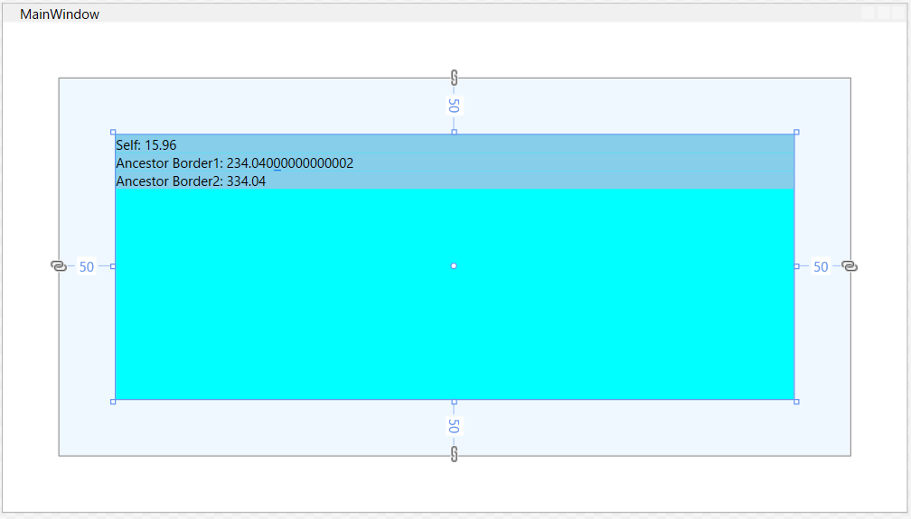
一般
RelativeSource
Mode=は省略可能。
FindAncestor で祖先をたどり、AncestorType で型を特定する。AncestorLevel で何番目にマッチした祖先かを決定する。
  <Border Background="AliceBlue" Margin="50">
    <Border Background="Aqua" Margin="50">
        <StackPanel>
            <TextBlock Background="SkyBlue"
                       Text="{Binding ActualHeight, RelativeSource={RelativeSource Mode=Self}, StringFormat=Self: {0}}"/>
            <TextBlock Background="SkyBlue"
                       Text="{Binding ActualHeight, RelativeSource={RelativeSource Mode=FindAncestor, AncestorType=Border}, StringFormat=Ancestor Border1: {0}}"/>
            <TextBlock Background="SkyBlue"
                       Text="{Binding ActualHeight, RelativeSource={RelativeSource Mode=FindAncestor, AncestorType=Border, AncestorLevel=2}, StringFormat=Ancestor Border2: {0}}"/>
        </StackPanel>
    </Border>
</Border>
Parameter などに struct を渡す
タグのネストを分解して定義する。
<RowDefinition>
<RowDefinitionHeight>
<Binding Path="IsVisible" Converter="{StaticResource Converter}">
<BindingConverterParameter>
<GridLength>2*</GridLength>
</BindingConverterParameter>
</Binding>
</RowDefinitionHeight>
</RowDefinition>
ショートカットキー
<WindowInputBindings>
<KeyBinding Gesture="Ctrl+Shift+V" Command="{Binding NewPasteCommand}"/>
</WindowInputBindings>
Modifiers と Key を使う場合、Modifiers は1個しか指定できない。
<WindowInputBindings>
<KeyBinding Modifiers="Ctrl" Key="V" Command="{Binding PasteCommand}"/>
</WindowInputBindings>
Loadedイベントでコマンド呼び出す
xmlns:b="http://schemas.microsoft.com/xaml/behaviors"
<bInteractionTriggers>
<bEventTrigger EventName="Loaded">
<bInvokeCommandAction Command="{Binding LoadedCommand}"/>
</bEventTrigger>
</bInteractionTriggers>
デザイン時のみ~
.NET Core になって使えなくなったっぽい。コードビハインドも動かなかった。
.NET Core 3.0でWPFしてみました。Nekoni.DataValidation - 猫に.NET
Window
起動時のWindowのサイズ
<Window ...
    WindowState="Normal" />
| WindowState |
|
| Maximized |
最大化 |
| Minimized |
最小化 |
| Normal |
元のサイズ |
線
グラデーションのかかった線を引く
<Rectangle Height="5" Width="300">
<RectangleFill>
<LinearGradientBrush StartPoint="0,0.5" EndPoint="1,0.5">
<GradientStop Color="Aqua" Offset="0.0" />
<GradientStop Color="BlueViolet" Offset="1.0" />
</LinearGradientBrush>
</RectangleFill>
</Rectangle>

Painting with Solid Colors and Gradients Overview - WPF .NET Framework | Microsoft Docs
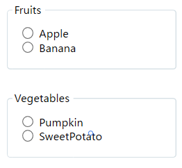
グルーピング
    <GroupBox Header="Fruits" Margin="10">
        <StackPanel Margin="10">
            <RadioButton GroupName="Fruits" Content="Apple" />
            <RadioButton GroupName="Fruits" Content="Banana" />
        </StackPanel>
    </GroupBox>
    <GroupBox Header="Vegetables" Margin="10">
        <StackPanel Margin="10">
            <RadioButton GroupName="Vegetables" Content="Pumpkin" />
            <RadioButton GroupName="Vegetables" Content="SweetPotato" />
        </StackPanel>
    </GroupBox>
enumをバインドするValueConverter
<RadioButton GroupName="Fruits" Content="Apple">
<RadioButtonLayoutTransform>
<ScaleTransform ScaleX="2.0" ScaleY="2.0"/>
</RadioButtonLayoutTransform>
</RadioButton>
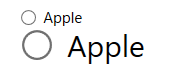
RadioButton は ToggleButton を継承しているので、ToggleButtonのスタイルを適用できる。
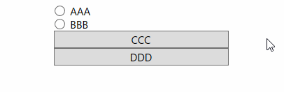
    <StackPanel>
        <RadioButton Content="AAA"/>
        <RadioButton Content="BBB"/>
        <RadioButton Style="{StaticResource {x:Type ToggleButton}}" Content="CCC"/>
        <RadioButton Style="{StaticResource {x:Type ToggleButton}}" Content="DDD"/>
    </StackPanel>
Enterキーでボタンのクリックを処理する
Button に IsDefault="True" を設定する。
<StackPanel FocusManagerFocusedElement="{Binding ElementName=textBox}">
<TextBox xName="textBox" Margin="20"/>
<Button Width="50" Height="30" Content="OK" Click="Button_Click" IsDefault="True"/>
</StackPanel>
github.com
ボタンに画像を表示する
<Button Width="320" Height="180" Margin="10">
    <Grid>
        <Image Source="/Resources/ButtonImage.jpg" />
        <Rectangle Fill="Gray" Opacity="0.5" Visibility="{
Binding IsEnabled,
RelativeSource={RelativeSource Mode=FindAncestor, AncestorType=Button},
Converter={StaticResource boolInvertToVisibilityConverter}}"/>
        <Label Content="Click" Foreground="White" FontSize="18" HorizontalAlignment="Center" VerticalAlignment="Bottom"/>
    </Grid>
</Button>
画像は Resources フォルダに追加して、プロパティのビルドアクションをリソースにする。Converter については後述。


Grid
Row番号を表示する
<Grid>
<GridRowDefinitions>
<RowDefinition/>
<RowDefinition/>
<RowDefinition/>
</GridRowDefinitions>
<TextBlock GridRow="0" Text="{Binding (Grid.Row), RelativeSource={RelativeSource Self}}"/>
<TextBlock GridRow="1" Text="{Binding (Grid.Row), RelativeSource={RelativeSource Self}}"/>
<TextBlock GridRow="2" Text="{Binding (Grid.Row), RelativeSource={RelativeSource Self}}"/>
</Grid>
Visibility をRow/Columnの長さに変換する ValueConverter
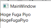
TextBlock
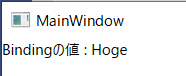
書式
<TextBlock Text="{Binding Text1, StringFormat=Bindingの値 : {0}}"/>
     <TextBlock>
        <Run Text="{Binding Text1}"/>
        <Run Text="{Binding Text2}"/>
        <Run Text="{Binding Text3}"/>
    </TextBlock>
<TextBlock>
<TextBlockText>
<MultiBinding StringFormat="{}{0}{1}{2}">
<Binding Path="Text1"/>
<Binding Path="Text2"/>
<Binding Path="Text3"/>
</MultiBinding>
</TextBlockText>
</TextBlock>
文字に縁取りを付ける
改行する
<TextBlock Text="aaa
bbb"/>
<TextBlock Text="aaa bbb"/>
<TextBlock Text="aaa bbb"/>
    <TextBlock >
        aaa<LineBreak/>bbb
    </TextBlock>
<TextBlock xmlspace="preserve">aaa
bbb
</TextBlock>
TextBox
複数行入力する
<TextBox Margin="20" AcceptsReturn="True"/>
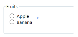
GroupBox
コンテンツを枠で囲む
    <GroupBox Header="Fruits" Margin="10">
        <StackPanel Margin="10">
            <RadioButton GroupName="Fruits" Content="Apple" />
            <RadioButton GroupName="Fruits" Content="Banana" />
        </StackPanel>
    </GroupBox>
基本的な使い方
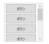
デフォルトだとコンテンツのサイズに関係なくどこでもスクロールの位置を決定できる。(参考)
      <ScrollViewer>
        <StackPanel>
            <Button Content="ボタン"/>
            <Button Content="ボタン"/>
            <Button Content="ボタン"/>
        </StackPanel>
    </ScrollViewer>

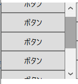
CanContentScroll のオプションでコンテンツのTOPにフィットするようにスクロールを制限できる。
CanContentScroll="True"
VerticalScrollBarVisibility のオプションを Auto にすると、スクロールが不要なサイズの場合スクロールバー自体を非表示にできる。
VerticalScrollBarVisibility="Auto"
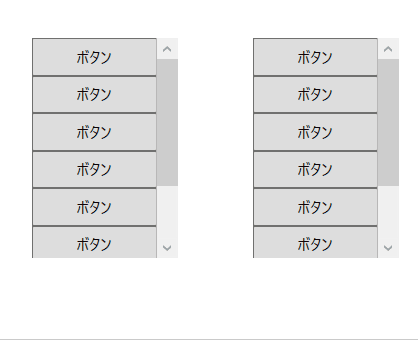
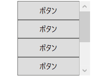
ListBox
スクロールバーを表示する
<ListBox ScrollViewerCanContentScroll="True">
<Button Content="ボタン"/>
<Button Content="ボタン"/>
<Button Content="ボタン"/>
</ListBox>
複数選択をViewModelにバインドする
Reactive Property を使った例。
<ListBox ItemsSource="{Binding Items}" DisplayMemberPath="Name.Value" SelectionMode="Multiple">
<ListBoxItemContainerStyle>
<Style TargetType="ListBoxItem">
<Setter Property="IsSelected" Value="{Binding IsSelected.Value}"/>
</Style>
</ListBoxItemContainerStyle>
</ListBox>
public partial class ListBoxSample : UserControl
{
public ListBoxSample()
{
InitializeComponent();
var vm = new ListBoxViewModel();
DataContext = vm;
}
}
public class ListBoxViewModel : ViewModelBase
{
public ReactiveCollection<ListBoxItemViewModel> Items { get; } = new ReactiveCollection<ListBoxItemViewModel>();
}
public class ListBoxItemViewModel
{
public ReactiveProperty<bool> IsSelected { get; } = new ReactiveProperty<bool>();
public ReactiveProperty<string> Name { get; } = new ReactiveProperty<string>();
}
ComboBox
<ComboBox ItemsSource="{Binding Items}"
    DisplayMemberPath="Value" SelectedValuePath="Key"
    SelectedItem="{Binding SelectedItem.Value}"/>
public class ComboBoxSampleViewModel
{
    public ReactiveCollection<KeyValuePair<string, string>> Items { get; set; } = new ReactiveCollection<KeyValuePair<string, string>>();
    public ReactiveProperty<KeyValuePair<string, string>> SelectedItem { get; } = new ReactiveProperty<KeyValuePair<string, string>>();
}
TreeView
XAML。
<TreeView ItemsSource="{Binding Items}">
<TreeViewItemTemplate>
<HierarchicalDataTemplate DataType="local:TreeViewSampleItemViewModel" ItemsSource="{Binding Children}">
<TextBlock Text="{Binding Label.Value}"/>
</HierarchicalDataTemplate>
</TreeViewItemTemplate>
</TreeView>
ViewModel。
public class TreeViewSampleViewModel
{
    public ReactiveCollection<TreeViewSampleItemViewModel> Items { get; set; } = new ReactiveCollection<TreeViewSampleItemViewModel>();
}

public class TreeViewSampleItemViewModel
{
    public ReactiveProperty<string> Label { get; } = new ReactiveProperty<string>();
    public ReactiveCollection<TreeViewSampleItemViewModel> Children { get; } = new ReactiveCollection<TreeViewSampleItemViewModel>();

    public TreeViewSampleItemViewModel(string label)
    {
        Label.Value = label;
    }
}
データ例。
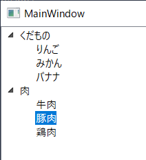
コードビハインド。
public class TreeViewSample
{
    public TreeViewSample()
    {
        InitializeComponent();
        var vm = new TreeViewSampleViewModel();
        {
            var item = new TreeViewSampleItemViewModel("くだもの");
            item.Child.Add(new TreeViewSampleItemViewModel("りんご"));
            item.Child.Add(new TreeViewSampleItemViewModel("みかん"));
            item.Child.Add(new TreeViewSampleItemViewModel("バナナ"));
            vm.Items.Add(item);
        }
        {
            var item = new TreeViewSampleItemViewModel("肉");
            item.Child.Add(new TreeViewSampleItemViewModel("牛肉"));
            item.Child.Add(new TreeViewSampleItemViewModel("豚肉"));
            item.Child.Add(new TreeViewSampleItemViewModel("鶏肉"));
            vm.Items.Add(item);
        }

        DataContext = vm;
    }
}
その他、スクロールバーを表示するなど。
ScrollViewer.HorizontalScrollBarVisibility="Auto"
ScrollViewer.VerticalScrollBarVisibility="Auto"
ScrollViewer.CanContentScroll="True"
子のみ選択可能にする
実装例1。
親ノードはフォーカスできないようにする。
また、折り畳んだ時に親ノードが選択状態になるのでイベントで選択を解除する。
ItemContainerStyle で EventSetter を使うパターン。コマンドは使えないっぽい。
XAML。
<TreeView ItemsSource="{Binding Items}">
<TreeViewItemTemplate>
<HierarchicalDataTemplate DataType="local:TreeViewSampleItemViewModel" ItemsSource="{Binding Children}">
<TextBlock Text="{Binding Label.Value}"/>
</HierarchicalDataTemplate>
</TreeViewItemTemplate>
<TreeViewItemContainerStyle>
<Style TargetType="{x:Type TreeViewItem}">
<StyleTriggers>
<Trigger Property="HasItems" Value="true">
<Setter Property="Focusable" Value="False" />
</Trigger>
</StyleTriggers>
<EventSetter Event="Collapsed" Handler="TreeViewItem_Collapsed"/>
</Style>
</TreeViewItemContainerStyle>
</TreeView>
コードビハインド。
        private void TreeViewItem_Collapsed(object sender, RoutedEventArgs e)
        {
            (sender as TreeViewItem).IsSelected = false;
        }
実装例2。
IsSelected プロパティを ViewModel とバインドし、変更通知を受けた時に親ノードだったら選択解除する。
XAML。
<TreeView ItemsSource="{Binding Items}">
<TreeViewItemTemplate>
<HierarchicalDataTemplate DataType="local:TreeViewSampleItemViewModel" ItemsSource="{Binding Children}">
<TextBlock Text="{Binding Label.Value}"/>
</HierarchicalDataTemplate>
</TreeViewItemTemplate>
<TreeViewItemContainerStyle>
<Style TargetType="{x:Type TreeViewItem}">
<Setter Property="IsSelected" Value="{Binding IsSelected.Value}"/>
</Style>
</TreeViewItemContainerStyle>
</TreeView>
CollectionChangedAsObservable で IsLeaf をハンドリングするので、コレクションに Add されない子の場合常に初期値となるので、初期値を true にしておかなく必要がある。
ViewModel。
public class TreeViewSampleItemViewModel
{
    public ReactiveProperty<string> Label { get; } = new ReactiveProperty<string>();
    public ReactiveCollection<TreeViewSampleItemViewModel> Children { get; } = new ReactiveCollection<TreeViewSampleItemViewModel>();
    public ReactiveProperty<bool> IsSelected { get; } = new ReactiveProperty<bool>();
    public ReactiveProperty<bool> IsNode { get; }
    public ReactiveProperty<bool> IsLeaf { get; }

    public TreeViewSampleItemViewModel(string label)
    {
        Label.Value = label;
        IsLeaf = Children.CollectionChangedAsObservable().Select(_ => Children.Count == 0).ToReactiveProperty(true);
        IsNode = IsLeaf.Select(x => !x).ToReactiveProperty();

        IsSelected.Subscribe(x =>
        {
            if (x && IsNode.Value)
            {
                IsSelected.Value = false;
            }
        });
    }
}
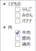
XAML。
<TreeView ItemsSource="{Binding Items}">
<TreeViewItemTemplate>
<HierarchicalDataTemplate DataType="local:TreeViewSampleItemViewModel" ItemsSource="{Binding Children}">
<StackPanel Orientation="Horizontal">
<TextBlock Text="{Binding Label.Value}" Visibility="{Binding IsNode.Value, Converter={StaticResource BoolToVisibility}}"/>
<CheckBox Content="{Binding Label.Value}" Visibility="{Binding IsLeaf.Value, Converter={StaticResource BoolToVisibility}}"
IsChecked="{Binding IsSelected.Value}"/>
</StackPanel>
</HierarchicalDataTemplate>
</TreeViewItemTemplate>
<TreeViewItemContainerStyle>
<Style TargetType="{x:Type TreeViewItem}">
<Setter Property="IsSelected" Value="False"/>
<Setter Property="Focusable" Value="False"/>
</Style>
</TreeViewItemContainerStyle>
</TreeView>
ViewModel。
    public class TreeViewSampleItemViewModel
    {
        public ReactiveProperty<string> Label { get; } = new ReactiveProperty<string>();
        public ReactiveCollection<TreeViewSampleItemViewModel> Children { get; } = new ReactiveCollection<TreeViewSampleItemViewModel>();
        public ReactiveProperty<bool> IsSelected { get; } = new ReactiveProperty<bool>();
        public ReactiveProperty<bool> IsNode { get; }
        public ReactiveProperty<bool> IsLeaf { get; }

        public TreeViewSampleItemViewModel(string label)
        {
            Label.Value = label;
            IsLeaf = Children.CollectionChangedAsObservable().Select(_ => Children.Count == 0).ToReactiveProperty(true);
            IsNode = IsLeaf.Select(x => !x).ToReactiveProperty();
        }
    }
ValueConverter
BooleanToVisibilityConverter
名前空間を宣言しなくても使えるようになっている。(.NET Core 3.1)
<UserControlResources>
<BooleanToVisibilityConverter xKey="BoolToVisibility"/>
</UserControlResources>
enumをバインドするValueConverter
Visibility をRow/Columnの長さに変換する ValueConverter
Visibility を変換する ValueConverter
[ValueConversion(typeof(Visibility), typeof(GridLength))]
public class VisibilityToGridLengthConverter : IValueConverter
{
    public object Convert(object value, Type targetType, object parameter, CultureInfo culture)
    {
        if (value is Visibility == false)
            throw new ArgumentException("value type is not supported.");
        if (parameter != null && parameter is GridLength == false)
            throw new ArgumentException("parameter type is not supported.");

        var visibility = (Visibility)value;
        var result = parameter != null
            ? (GridLength)parameter
            : new GridLength(1, GridUnitType.Star);

        return visibility == Visibility.Visible ? result : new GridLength(0);
    }

    public object ConvertBack(object value, Type targetType, object parameter, CultureInfo culture)
    {
        throw new NotImplementedException();
    }
}
xaml
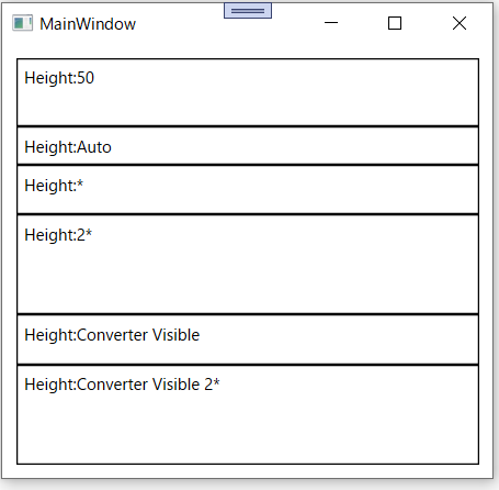
<Grid Margin="10">
<GridResources>
<localVisibilityToGridLengthConverter xKey="Converter"/>
</GridResources>
<GridRowDefinitions>
<RowDefinition Height="50"/>
<RowDefinition Height="Auto"/>
<RowDefinition Height="*"/>
<RowDefinition Height="2*"/>
<RowDefinition Height="{Binding Collapsed, Converter={StaticResource Converter}}"/>
<RowDefinition Height="{Binding Visible, Converter={StaticResource Converter}}"/>
<RowDefinition>
<RowDefinitionHeight>
<Binding Path="Visible" Converter="{StaticResource Converter}">
<BindingConverterParameter>
<GridLength>2*</GridLength>
</BindingConverterParameter>
</Binding>
</RowDefinitionHeight>
</RowDefinition>
</GridRowDefinitions>
<Label GridRow="0" BorderThickness="1" BorderBrush="Black" Content="Height:50"/>
<Label GridRow="1" BorderThickness="1" BorderBrush="Black" Content="Height:Auto"/>
<Label GridRow="2" BorderThickness="1" BorderBrush="Black" Content="Height:*"/>
<Label GridRow="3" BorderThickness="1" BorderBrush="Black" Content="Height:2*"/>
<Label GridRow="4" BorderThickness="1" BorderBrush="Black" Content="Height:Converter Collapsed"/>
<Label GridRow="5" BorderThickness="1" BorderBrush="Black" Content="Height:Converter Visible"/>
<Label GridRow="6" BorderThickness="1" BorderBrush="Black" Content="Height:Converter Visible 2*"/>
</Grid>
bool を変換する場合
[ValueConversion(typeof(bool), typeof(GridLength))]
public class BoolToGridLengthConverter : IValueConverter
{
    public object Convert(object value, Type targetType, object parameter, CultureInfo culture)
    {
        if (value is bool == false)
            throw new ArgumentException("value type is not supported.");
        if (parameter != null && parameter is GridLength == false)
            throw new ArgumentException("parameter type is not supported.");

        var isVisible = (bool)value;
        var result = parameter != null
            ? (GridLength)parameter
            : new GridLength(1, GridUnitType.Star);

        return isVisible ? result : new GridLength(0);
    }

    public object ConvertBack(object value, Type targetType, object parameter, CultureInfo culture)
    {
        throw new NotImplementedException();
    }
}
double を変換する場合
[ValueConversion(typeof(double), typeof(GridLength))]
public class DoubleToGridLengthConverter : IValueConverter
{
    public object Convert(object value, Type targetType, object parameter, CultureInfo culture)
    {
        if (value is double == false)
            throw new ArgumentException("value's type is not supported.");
        if (parameter != null && parameter is GridLength == false)
            throw new ArgumentException("parameter's type is not supported.");

        var length = (double)value;
        var result = parameter != null ? (GridLength)parameter
            : double.IsNaN(length) ? new GridLength(1, GridUnitType.Star)
            : new GridLength(length);

        return result;
    }

    public object ConvertBack(object value, Type targetType, object parameter, CultureInfo culture)
    {
        throw new NotImplementedException();
    }
}
bool を反転する ValueConverter
[ValueConversion(typeof(bool), typeof(bool))]
public class BoolInvertConverter : IValueConverter
{
    public object Convert(object value, Type targetType, object parameter, CultureInfo culture)
    {
        if (value == null || value is bool == false)
            return false;

        return !(bool)value;
    }

    public object ConvertBack(object value, Type targetType, object parameter, CultureInfo culture)
    {
        if (value == null || value is bool == false)
            return false;

        return !(bool)value;
    }
}
複数の ValueConverter を組み合わる ValueConverter
[ContentProperty(nameof(Converters))]
public class CompositeValueConverter : IValueConverter
{
    public Collection<IValueConverter> Converters { get; } = new Collection<IValueConverter>();

    public object Convert(object value, Type targetType, object parameter, CultureInfo culture)
    {
        if (Converters == null) { return value; }

        var result = value;
        foreach (var conv in Converters)
        {
            result = conv.Convert(result, targetType, parameter, culture);
        }

        return result;
    }

    public object ConvertBack(object value, Type targetType, object parameter, CultureInfo culture)
    {
        if (Converters == null) { return value; }

        var result = value;
        foreach (var conv in Converters.Reverse())
        {
            result = conv.Convert(result, targetType, parameter, culture);
        }

        return result;
    }
}
bool を反転して Visibility に変換するコンバーターの例。
<UserControlResources>
<convCompositeValueConverter xKey="boolInvertToVisibilityConverter">
<convBoolInvertConverter/>
<BooleanToVisibilityConverter/>
</convCompositeValueConverter>
</UserControlResources>
参考)WPF 複数のValueConverterを連結して順番に変換する - OITA: Oika's Information Technological Activities
Command
CommandParameter に enum を指定する
public enum Food
{
    Banana,
    Apple,
}
名前空間を宣言して
xmlns:local="clr-namespace:SampleApp.Data"
x:Static で指定する
<Button CommandParameter="{x:Static local:Food.Apple}" />
CommandParameter にプリミティブ型を使用する
xmlns:system="clr-namespace:System;assembly=System.Runtime"
<Button Content="はい" Command="{Binding ConfirmCommand}" >
<ButtonCommandParameter>
<systemBoolean>true</sysBoolean>
</ButtonCommandParameter>
</Button>
フォーカス
基本的な使い方
XAMLの場合。
<Grid FocusManagerFocusedElement="{Binding ElementName=button}">
...
</Grid>
コードビハインドの場合。
button.Focus();
ViewModelから設定
ViewModelからフォーカスを制御するには、FocusBehaviorを作成して設定する。
public static class FocusBehavior
{
    public static bool GetIsFocused(DependencyObject obj)
    {
        return (bool)obj.GetValue(IsFocusedProperty);
    }

    public static void SetIsFocused(DependencyObject obj, bool value)
    {
        obj.SetValue(IsFocusedProperty, value);
    }

    public static readonly DependencyProperty IsFocusedProperty =
        DependencyProperty.RegisterAttached("IsFocused", typeof(bool), typeof(FocusBehavior), new UIPropertyMetadata(false, OnIsFocusedPropertyChanged));

    private static void OnIsFocusedPropertyChanged(DependencyObject d, DependencyPropertyChangedEventArgs e)
    {
        var ui = (UIElement)d;
        if ((bool)e.NewValue)
        {
            ui.Focus();
        }
    }
}
XAMLとViewModel。任意のタイミングで IsFocused の値を true にするとフォーカスを設定できる。
<Button b:FocusBehavior.IsFocused="{Binding IsFocused.Value}"/>
public ReactiveProperty<bool> IsFocused { get; } = new ReactiveProperty<bool>();
アニメーション
点滅
Resource に Storyboard を定義する。
<Storyboard xKey="BlinkAnimation">
<DoubleAnimationUsingKeyFrames StoryboardTargetProperty="(UIElement.Opacity)" RepeatBehavior="Forever" AutoReverse="True">
<LinearDoubleKeyFrame KeyTime="0:0:0.2" Value="1" />
<LinearDoubleKeyFrame KeyTime="0:0:0.8" Value="0" />
</DoubleAnimationUsingKeyFrames>
</Storyboard>
使い方。
<TextBlock Text="Click me">
<TextBlockTriggers>
<EventTrigger RoutedEvent="TextBlock.Loaded">
<BeginStoryboard Storyboard="{StaticResource BlinkAnimation}"/>
</EventTrigger>
</TextBlockTriggers>
</TextBlock>
error MC3000: XML 指定されたエンコードに無効な文字があります。
XAMLファイルのエンコードがシフトJISなどで保存されており日本語を使うと文字化けしてる可能性があるので、XAMLファイルのエンコードをUTF-8にして上書き保存する。
.NET Core クラスライブラリでWPFの機能を使う
<UseWPF>true</UseWPF> をプロジェクトファイルに追加する。
<Project Sdk="Microsoft.NET.Sdk">

  <PropertyGroup>
    <TargetFramework>netcoreapp3.1</TargetFramework>
    <UseWPF>true</UseWPF>
  </PropertyGroup>

</Project>
アプリケーション一般
アプリケーションのバージョンを取得する
var assembly = Assembly.GetExecutingAssembly();
var name = assembly.GetName();
var version = name.Version;
var strVersion = version?.ToString();
二重起動の防止
Mutex を使う場合。
public partial class App : Application
{
    private static Mutex _mutex;

    protected override void OnStartup(StartupEventArgs e)
    {
        _mutex = new Mutex(false, "一意となるName");
        if (!_mutex.WaitOne(0, false))
        {
            MessageBox.Show("既に起動しています");
            _mutex.Close();
            _mutex = null;
            Shutdown();
        }

        base.OnStartup(e);
    }
    protected override void OnExit(ExitEventArgs e)
    {
        if (_mutex != null)
        {
            _mutex.ReleaseMutex();
            _mutex.Close();
            _mutex = null;
        }

        base.OnExit(e);
    }
}
Semaphore を使う場合。
public partial class App : Application
{
    private static Semaphore semaphore;

    protected override void OnStartup(StartupEventArgs e)
    {
        semaphore = new Semaphore(1, 1, "一意となるName", out var createdNew);
        if (!createdNew)
        {
            MessageBox.Show("既に起動しています");
            Shutdown();
        }

        base.OnStartup(e);
    }
    protected override void OnExit(ExitEventArgs e)
    {
        if (semaphore != null)
        {
            semaphore.Dispose();
            semaphore = null;
        }

        base.OnExit(e);
    }
}
未処理例外の捕捉


